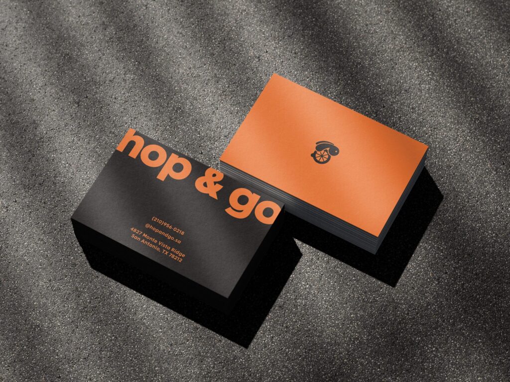
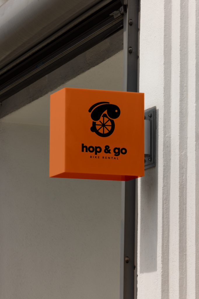
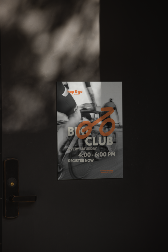
For this project, I created the brand identity for Hop & Go Bike Rental, combining the idea of movement with a bunny as the main concept. The bunny represents speed, agility, and lightness, which connects directly to the experience of riding a bike and moving easily through the city. The visual direction is minimal and clean, allowing the concept to feel modern while still being approachable. I designed the logo, icon, and additional collaterals to create a cohesive system that can be applied across different touchpoints of the brand. The bright orange color was chosen to convey energy and excitement, while still maintaining a balanced and polished look. It helps the brand stand out and feel inviting without being overwhelming.The target audience is mainly people who are into bike riding, but the identity was designed to be flexible and accessible so it can appeal to anyone looking for a simple and enjoyable way to get around.